Fiddling with my phone I saw a new feature this past weekend. It came and went a few times which means that Google is testing it out and I happened to hit their servers during the test.
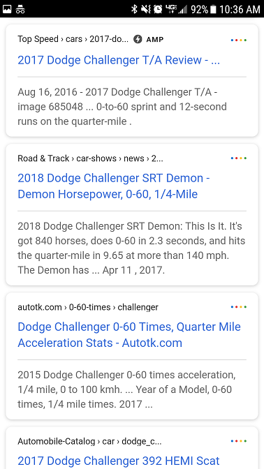
The new layout includes a card-like (aka boxed) layout which looks nice. AMP pages got a neat new logo.
I checked with some of my “normal” friends about this new layout and asked them what they thought of it but nobody seemed to care or know what I was talking about. 🙂
Although everyone did want to click the 4 little buttons, which simply take you to the website they’re beside. The 4 dots look a lot like a menu option. No clue why they would add this – it is very confusing.
Here’s a screenshot of the changes being tested:
Have you seen this?
I first discovered it July 16, 2017 at 10:30AM at Sunday brunch. That is a good time to ponder just how fast the new Dodge Challengers do 0-60, isn’t it??
If you have seen this, please let me know when it popped up for you.
- Google “Pure Spam” Penalty Deindexes Sites March 6 2024 - March 12, 2024
- What Happened to ChicagoNow.com? - August 30, 2022
- The December 2021 Google Local Pack Algorithm Update - December 17, 2021


Amp looks like its here to stay and the story is it boosts click through as with all new quirks. Lets see how it goes.
For most small businesses, AMP sucks! It is easy to add to WordPress but you are likely going to need to hire a designer to get the AMP page to look like the rest of your site again. It is a small nightmare and doesn’t increase rankings.
Some people say it increases click through rates. I think the vast majority of those people are wrong. I’ve asked a dozen friends to look at search results and so far zero of them have any idea what the AMP symbol means. In fact, a couple of them didn’t want to click it since they didn’t know what it was!
But anyways, I think you are correct and it is here to stay for a while. And if I were CNN or a publisher, yes I’d definitely add AMP to my site. I work with a few sites that use it alongside their CDN. Interesting stuff..