April 21, 2015, Google updated their algorithm to affect the way pages display in search when using a mobile device such as a smartphone.
The general thought was that sites which were not “mobile friendly” would perform worse in mobile search. This makes sense as pages which are not mobile-firendly generally provide a poor user experience resulting in people backing up out of the page and going to a different site completely. The media got involved with this update and hyped it up as “Mobilegeddon”.
April 21 has passed and the much hyped has come and gone. It appears that the changes are still rolling out. Today (April 23, 2015) I began to see the first real noticeable changes in mobile search. I expect there to be more to come in the near future.
I have screenshots for a wide variety of niches which I mostly use for my own internal investigations. Here is a very brief example of how things have changed. I am seeing very similar results in a variety of niches, with the harshest rankings drop hitting larger brand websites.
Is not having a mobile friendly site just one of the many factors determining where you site will display in mobile SERP? Or is the algorithm just getting warmed up? Are there multiple usability factors in play determine search results? All of these answers have yet to be determined. Maybe someone will do an in depth study. I think we will see a lot change in the next week or two.
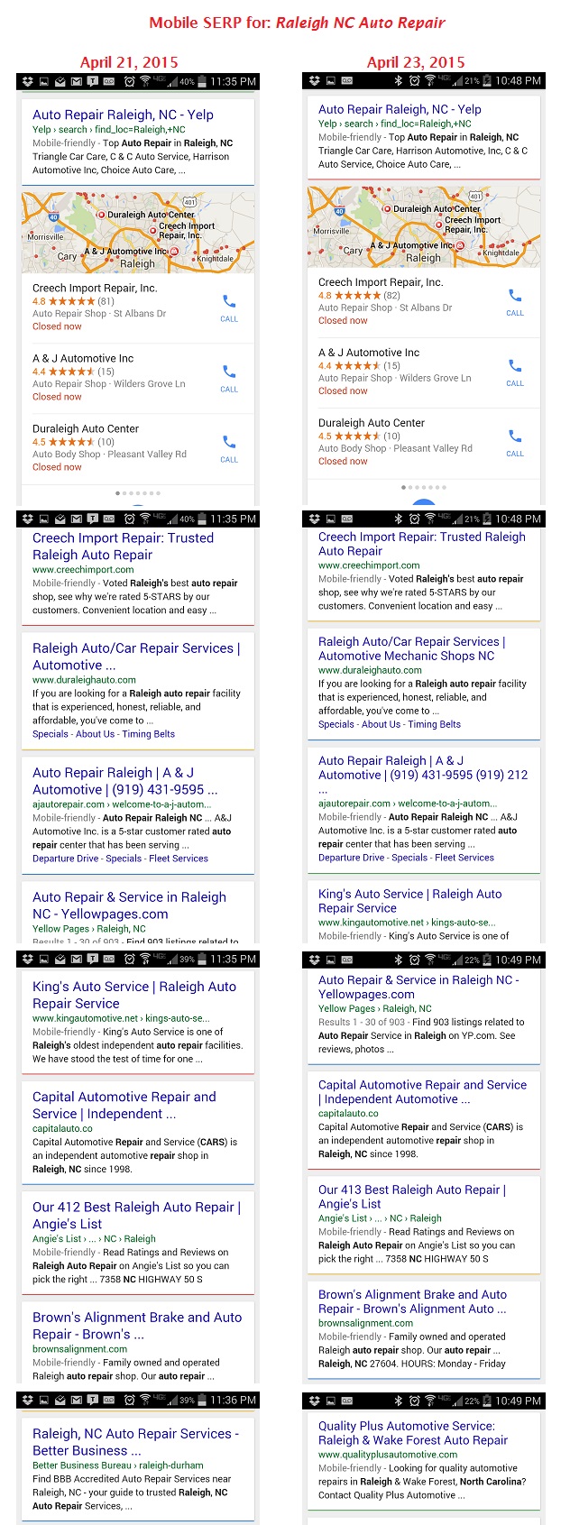
Before and after
This search is for Raleigh NC Auto Repair. Below you can see that Yellowpages.com lost a position- this may or may not have been due to the mobile friendly search update. There is a loser on this page however, and it is the BBB. The BBB is still #10 on desktop search, but is now #30 in mobile search.
Nothing huge to see in these screenshots. So far what I’m seeing is some minor shifting, and some big losses for a few sites here and there. More news on this soon.
- Google “Pure Spam” Penalty Deindexes Sites March 6 2024 - March 12, 2024
- What Happened to ChicagoNow.com? - August 30, 2022
- The December 2021 Google Local Pack Algorithm Update - December 17, 2021

Leave a Reply